NPPA BOP
Web Design, UX Design, Brand Desgin
April 2025

Project Details
Duration
2 months
Roles
Brand Designer
Web Designer
Information Architect
Tools Used
Adobe Illustrator
Figma
Project Type
Client
The Ask
The National Press Photographers Association hosts a Best of Photojournalism competition each year. The BOP competition is large, with many divisions, categories, and winners. My job was to redesign their website, implementing stronger information hierarchy, increased organization, and a more enhanced overall user experience.
Specifically, I redesigned the BOP logo, desktop footer and navigation, and a competition page. In doing so, I redefined the BOP's visual identity and implemented a style guide.
Logo
I wanted a logo lockup that was simplistic, sharp, and creatively smart - traits reflective of the work the website is meant to house. I took font and color inspiration from the NPPA logo in order for the competition to look more cohesive with its host.

Design Solutions
Navigation
Before
Previously, all of the categories were simply pasted into a large body of text on a page for their parent division. The categories were not linked in any form of navigation, and they were repetitive and redundant.

After
So the user can easily browse and navigate to a specific category, I implemented a mega-menu navigation where hovering over a division will display all of its categories. I also created subcategories to house groups of similar categories under.

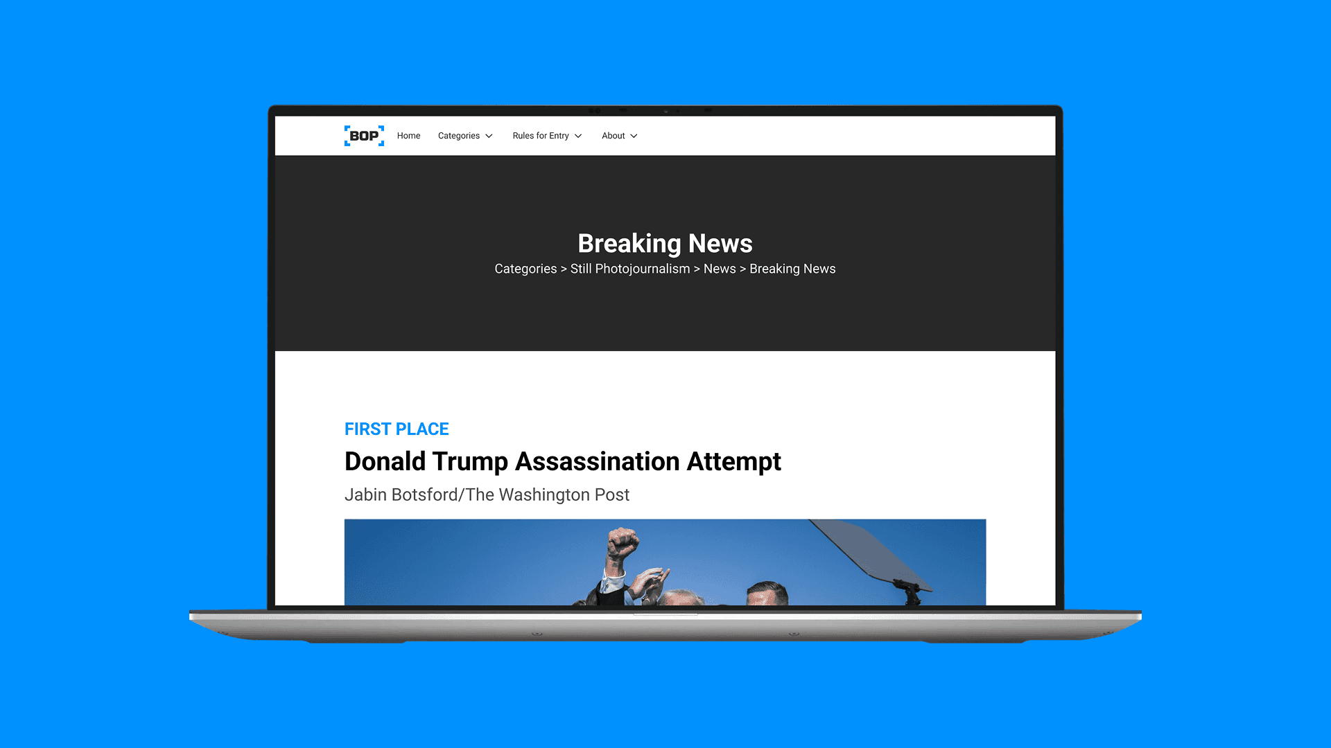
Category page
Before
The original layout lacked hierarchy and indication of where on the website the user was.

After
I implemented different heading styles to emphasize and differentiate information such as the name of the photographer, the description, which place, and the title of the piece. I also included the path to the page in the hero section, this way the user could easily understand where in the competition this category falls.

Takeaways
Challenges
I struggled with balancing effort versus impact. While I deemed some features - such as the mega menu - as being worth the effort needed to develop it, I had many previous iterations where other elements were more complex than needed. Knowing that the volunteer that runs the website desires a quick and easy way to update and maintain its information, I needed to ensure that layouts were consistent, responsive, and adaptable. Furthermore, I made layouts and design decisions that were more simple to code.
Lessons Learned
I learned a lot about the impact information architecture has on the user experience of navigating a website. Furthermore, I learned the importance of showing, rather than telling, a client why a certain solution worthwhile.

