EZ Eats
UX/UI Design, UX Research, Brand Design
May 2025

Project Details
Team
Solo
Tools Used
Figma
FigJam
Adobe Illustrator
Google Forms
Problem
Background
EZ Eats is a food ordering app specifically made for college students wanting or order ahead at on-campus facilities and pay with their existing meal plans.
Brief
My task was to create a logo and design system for EZ Eats, and the user flow for adding an item to cart and checking out. In creating the user flow, I conducted research to establish the target audience and key value proposition for the app.
Research
Finding a Value Proposition
Being that many food ordering apps exist, I wanted to design a product that met the niche needs of students ordering food on-campus. I conducted quantitative and qualitative research to identify gaps in the market, areas of opportunity, and user needs and values to address.
Problem Statement
How might we elevate the dining experience for university students?
Competitive Analysis
Systematically analyzing the features, strengths, and weaknesses of apps already on the market allowed me to see what works and what could be improved. By examining aspects such as UI design, user experience, content quality, and functionality, I was able to gain insights into industry standards and best practices. This analysis helped me define a unique value proposition by highlighting what differentiates EZ Eat's designs and features from competitors. Additionally, understanding competitors' approaches enabled me to avoid common pitfalls and capitalize on gaps in the market.

Surveys
I sent out a Google Form to students at different Universities to get a better sense of what options were already on the market, what needs were universally being unmet, and what key pain points and frustrations students faced when it comes to getting food on their campus. Sending a survey was an effective way to gather both quantitative and qualitative insights, which I used to guide me in determining what features I wanted to implement in my app. Originally, I wanted to target establishments in academic buildings, however after doing research I identified a much bigger gap in ordering from dining halls, which became the main value proposition of my app.

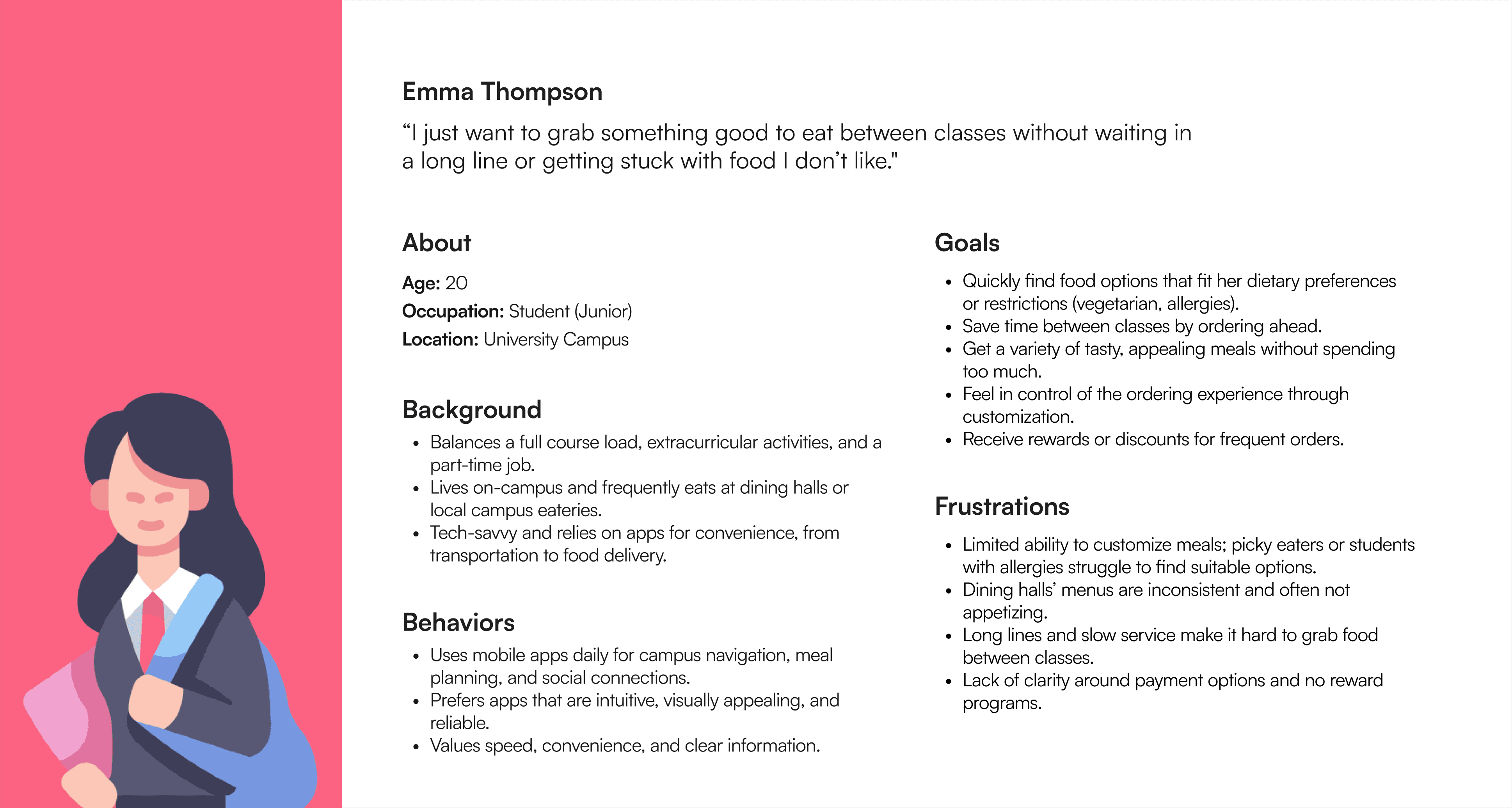
User Persona
I defined personas for the key users of this product. For the sake of time, I focused on the primary user type, the student. Below is the persona representing that user group.
Ideating Solutions to Key Pain Points
Throughout my research, I identified four main frustrations with existing (or lack thereof) food ordering processes:
Lack of ability to customize orders: specifically, picky eaters and students with allergies struggle with finding suitable options.
The overall process is not enjoyable: food options aren't all that appetizing and menus are constantly changing on a day-by-day basis.
Service is slow: dining halls get really crowded, students may have little time between classes to eat, and orders are frequently delayed.
Food options are expensive: lack of reward programs and clarity when understanding what payment methods are accepted at specific facilities.

Impact Effort Matrix
In order to identify which ideas to tackle first, I prioritized those that were the most feasible and would result in the greatest impact.

Wireframes
Mid-Fidelity Wireframes
Creating mid-fidelity wireframes allowed me to design a layout that effectively showcased the features and functionality that I planned to implement.

Design System
Logo
I wanted my logo to convey the key characteristics of my app: speed, reliability, and efficiency. Not only does the mark contain both an "e" and a "z", but it has an arrow which reflects the grab-n-go aspect of my product. Being that EZ Eats is a software intended to be sold to universities, I focused on using a minimalistic and geometric style that is frequently correlated with technology.
Design System
Based on the logo, I created a design system to be used throughout the app's interface. In doing so, I had to modify the color of the logo because it did have a high enough contrast ratio against white text to pass AA web content accessibility guidelines.

Mockups

Design Solutions
User Experience
I made strategic design decisions by implementing a data-driven and user-oriented approach.

Logo
I wanted the logo to portray the brand identity while also conveying they speed and efficiency that EZ Eats has to offer. I did this by combining an "e", "z" and arrow into one mark.


